 |
| UniPin fine line water and fade proof pigment ink |
Monday, December 26, 2011
Friday, December 23, 2011
McDonald's and an Elephant
My best friend and I had always connected the most through art and design. While I usually pour over 2D material like plain ol' paper, she does crazy stuff like gigantic paper-mache pieces and metal-welding whatchamacallits, and refers to quirky things like How-To-Make-Pop-Up-Books books. Oh, and did I mention that she's studying a crazy-ass course majoring in mechatronics and robotics, and one day she'll build a robot Ernie (from Sesame Street)? Yep, that's her, my best friend!
One of her not-so-recent-crazed-but-just-recently-started-on hobby is painting DIY toys (Click here for my last post on DIY toys). Here's a quick look on what she's working on now:

I think she's trying to make an Ernie-inspire Qee and bloody Ronald McDonald Munny. Hmmm... Let's just see how they'll go! Haha!
One of her not-so-recent-crazed-but-just-recently-started-on hobby is painting DIY toys (Click here for my last post on DIY toys). Here's a quick look on what she's working on now:

 |
| Her Elephant Baby Qee and Munny |
Thursday, December 22, 2011
Late In the Bandwagon: DIY Toys
When something's stark white, blank and staring back at you screaming "paint on me!" it's quite intimidating. But if it's as cute as these little things here, you can't resist but quickly doodle on them!
Lo and behold, the Munny!
What's this little thing, you say? Well, not only is it one of the most unique yet most versatile gifts this season, it's also a DIY toy which you can design however way you want! Usually painted on, the Munny is a cute little 3D space to pour your creativity out on. You can draw a face on it (maybe your own face! haha), re-do a familiar cartoon character in its shape, add accessories and clothes, and whatnot. At the end of the day, it's all about making the most creative littly Munny that you'll be proud to display (or play with!) in your room. How I wish I can paint a wall full of them one day!
Here are some quirky little designs of the Munny that I've seen in the net.
BUT WAIT! The Munny has got some competition.The company Toy2r also has their line of DIY toys called the Qee, the famous white blank bear-shaped toy which has been everywhere in every kind of design! Not sure what I'm talking about? Here it is:

Yes, we've all seen this bear and all the amazing designs people have been coming up here and there. C'mon, who doesn't like painting on cute little teddy bears right? Those who likes painting on other cute animals, that's who! Toy2r has now come up with even cuter shapes for its DIY toys in the form of rhinos, bunnies, and even Bart Simpson! (Yes, I'm serious. See for yourself!)


If there are designs for the Munny, here are designs (from the net again) of the Qees:
Aren't they cute?? The influx of the Munny and the Qee sure got people digging from their markets and paint sets, including my best friend (who's got a brother really addicted to these)! I'll post some pictures of her elephant Qee soon! :)
While some may think designing DIY toys is such a geeky hobby (okay, it IS a bit geeky), I find it such a fascinating innovation! Gone are the days when you're stumped with what to give your friends (or yourself)! Now, no matter what figurine you give, there's sure a Munny or a Qee for everyone! So excited to buy some of these little creatures and paint to my heart's desire (when I finally get some cash, that is!).
Do you have any Munnies, Qees or DIY toy designs? Share 'em with me! :)
Lo and behold, the Munny!
 |
| Add caption |
Here are some quirky little designs of the Munny that I've seen in the net.
 |
| Superman-inspired Munny by video game artist Barry Prioste. Photo taken from here. |
 |
| Iron Man-inspired Munny by Hefnatron. Photo taken from here. |
 | |
| Totem Munny from the Reactor-88 website. Photo taken from here. |
 | |
| Moogle Munny by a guy named Chris. Photo taken from here. |
BUT WAIT! The Munny has got some competition.The company Toy2r also has their line of DIY toys called the Qee, the famous white blank bear-shaped toy which has been everywhere in every kind of design! Not sure what I'm talking about? Here it is:

Yes, we've all seen this bear and all the amazing designs people have been coming up here and there. C'mon, who doesn't like painting on cute little teddy bears right? Those who likes painting on other cute animals, that's who! Toy2r has now come up with even cuter shapes for its DIY toys in the form of rhinos, bunnies, and even Bart Simpson! (Yes, I'm serious. See for yourself!)


If there are designs for the Munny, here are designs (from the net again) of the Qees:
 | |
| Deady Baby Qee. Photo taken from here. |
 | |
| Sahara Qee by Tokidoki. Photo taken from here. |
 |
| My personal favorite! - Voltron Qee by Rotobox. Photo taken from here. |
Aren't they cute?? The influx of the Munny and the Qee sure got people digging from their markets and paint sets, including my best friend (who's got a brother really addicted to these)! I'll post some pictures of her elephant Qee soon! :)
While some may think designing DIY toys is such a geeky hobby (okay, it IS a bit geeky), I find it such a fascinating innovation! Gone are the days when you're stumped with what to give your friends (or yourself)! Now, no matter what figurine you give, there's sure a Munny or a Qee for everyone! So excited to buy some of these little creatures and paint to my heart's desire (when I finally get some cash, that is!).
Do you have any Munnies, Qees or DIY toy designs? Share 'em with me! :)
Tuesday, December 13, 2011
Open Spaces Part 4 (Final Work)
After how many edits and posts (Click here to check them out! Part 1, Part 2, Part 3), I've finally gotten around finishing up this story book illustration! Woohoo!! With the help of other people's comments, here's what my final output looks like:
So main comments were the difficulty of reading because of the clutter in the background and the darkness of the whole thing. I came up with two resolutions: 1. make the text plain and straight, or 2. clean up the background. Well, as you can see, #2 won! Haha.
I really wanted to make this book fun, even if the story is kind of grim. And although I'd want to make the text simpler, I felt that the animation in the text more so emphasizes the art. Being a proud mama over the tiniest lines, I say YEY!! to seeing more of the details! Woot! Plus, the goal was to make this story fit for a children's book. So, the movements of the text and the shapes formed by the smoke and Lorena's "hair" (Do you see the shapes?) make the spreads pretty more interesting, if I do say so myself.
Finally finished with this project, I can't believe I could actually make something like this despite having used to softer illustrations and watercolor works. Now I can say I can take on cartoon-y illustration and bold sketches! Can't wait to work on more projects like this!
Hope you enjoyed:)
 |
| Spread 1 |
 |
| Spread 2 |
So main comments were the difficulty of reading because of the clutter in the background and the darkness of the whole thing. I came up with two resolutions: 1. make the text plain and straight, or 2. clean up the background. Well, as you can see, #2 won! Haha.
I really wanted to make this book fun, even if the story is kind of grim. And although I'd want to make the text simpler, I felt that the animation in the text more so emphasizes the art. Being a proud mama over the tiniest lines, I say YEY!! to seeing more of the details! Woot! Plus, the goal was to make this story fit for a children's book. So, the movements of the text and the shapes formed by the smoke and Lorena's "hair" (Do you see the shapes?) make the spreads pretty more interesting, if I do say so myself.
Finally finished with this project, I can't believe I could actually make something like this despite having used to softer illustrations and watercolor works. Now I can say I can take on cartoon-y illustration and bold sketches! Can't wait to work on more projects like this!
Hope you enjoyed:)
Monday, December 05, 2011
Open Spaces Part 3 (Lorena's Walls)
After a few days of lag, here's finally a new progress on the children's book art! (Check out how far it's come with the older posts! Stage 1 here and Stage 2 here) I did a bit of change with the text by adding a bit of animation to it. I was hoping for it to look like it was "walling up" Lorena. Like some kind of barricade while she was sleeping. What do you think?

Hmmm... would this be better than the older version? And how about the other page? Haven't gotten around fixing that up too! Oh, the lack of time!
If there's a soul out there reading this, please comment to help me out! :)

Hmmm... would this be better than the older version? And how about the other page? Haven't gotten around fixing that up too! Oh, the lack of time!
If there's a soul out there reading this, please comment to help me out! :)
Saturday, December 03, 2011
To Be Featured In A Magazine
Never in my life would I have thought I'd be featured in a magazine. So with the mere appearance of my name in last November's Meg Magazine, I was already ecstatic! Yes, I know, I'm kind of shallow, but let me just say that of course, that wasn't really the only reason (hey, I'm not that vain, y'know! haha).
A few months ago I interned in the top beauty and haircare company in the country and I handled a few marketing projects for one of its brands. The magazine feature was one of them as the brand launched its newest addition to its hair treatment line - the Sensoria Care Ultra Rich cream bath! Now I'm not here to advertise the product, but just to give a brief background, it's a hair treatment that deeply conditions dried-out chemically-treated locks. It, as I've mentioned in the interview/article, opens "an avenue for people to allow themselves to color their hair more often."
As luck would have it, Meg approached us looking for something exactly what the product offered. My boss and I grabbed the opportunity to have a feature in time with the product launching, and as they say, the rest was (very recent) history!
Here are some shots of the article that I very proudly turned to first upon opening the issue!


And just for kicks, my cute little friends joined in the photoshoot! Haha!
I feel like this will be the most my potential popularity can get me. Haha!
A few months ago I interned in the top beauty and haircare company in the country and I handled a few marketing projects for one of its brands. The magazine feature was one of them as the brand launched its newest addition to its hair treatment line - the Sensoria Care Ultra Rich cream bath! Now I'm not here to advertise the product, but just to give a brief background, it's a hair treatment that deeply conditions dried-out chemically-treated locks. It, as I've mentioned in the interview/article, opens "an avenue for people to allow themselves to color their hair more often."
As luck would have it, Meg approached us looking for something exactly what the product offered. My boss and I grabbed the opportunity to have a feature in time with the product launching, and as they say, the rest was (very recent) history!
Here are some shots of the article that I very proudly turned to first upon opening the issue!


 |
| Kim Chiu graces the November issue of Meg |
 |
| Hi, my name's Saur-e |
 |
| Popo me! |
 |
| I'm turTail |
Wednesday, November 30, 2011
Open Spaces Part 2 (Unedited Work)
From outlines to colored-in separated pages. Here are the unedited spreads from the Lorena Bumbilya outlines I posted last time! (Don't remember the post? Check out the initial stages of the project here.) You can click on the pictures to see them better.


I'm still gathering some comments to edit these colored spreads. So stay tuned for more progress to come!
Do you have comments yourself? I'd love to hear them! Don't be afraid to click on that comment button down there and let me get some of your advice. :)


 |
| 1st spread |


 |
| 2nd spread |
I'm still gathering some comments to edit these colored spreads. So stay tuned for more progress to come!
Do you have comments yourself? I'd love to hear them! Don't be afraid to click on that comment button down there and let me get some of your advice. :)
Monday, November 28, 2011
Open Spaces
A couple of months ago, I had this project to illustrate 2 spreads of an except from a "children's book story" (Lorena Bumbilya by Christian Tablazon). The quotations are intentional because although the task required me to draw for a children's book with bold lines, bright colors (y'know, the works), the story itself was not rainbows and butterflies. Set in the slums, it revolved around a malnourished girl who got her hair cut off because of lice, a symbolism (as I would take it) for her dignity and dreams.
The except went as such:
With her right eye, she watched the vehicles passing by all afternoon while she waited for alms. She was already unmindful of the smoke and heat of the noon.
It took her some time to find a place where she could sleep. This one didn't look so good but there's not much choice. Lorena curled up and tried to sleep and forget her hunger. She has tissue paper smeared with spaghetti sauce and banana peel for dinner. Now as she slowly dozed off, she imagined lots of expensive fruits in front of her instead of banana skin, or being inside a fast food munching on her coveted snacks and meals. But now, leftovers from the garbage can had to do. She also learned that the night was unusually cold when sleeping in open spaces.
Sounds grim, right? Well, I hope my illustrations won't be too! Crossing my fingers here cuz this is actually the first time I'd be drawing a human person in such cartoony and bold (not to mention sad) outlines. Here are the first few stages of work on this project:

The next stages of this project has yet to be posted! :)
The except went as such:
With her right eye, she watched the vehicles passing by all afternoon while she waited for alms. She was already unmindful of the smoke and heat of the noon.
It took her some time to find a place where she could sleep. This one didn't look so good but there's not much choice. Lorena curled up and tried to sleep and forget her hunger. She has tissue paper smeared with spaghetti sauce and banana peel for dinner. Now as she slowly dozed off, she imagined lots of expensive fruits in front of her instead of banana skin, or being inside a fast food munching on her coveted snacks and meals. But now, leftovers from the garbage can had to do. She also learned that the night was unusually cold when sleeping in open spaces.
Sounds grim, right? Well, I hope my illustrations won't be too! Crossing my fingers here cuz this is actually the first time I'd be drawing a human person in such cartoony and bold (not to mention sad) outlines. Here are the first few stages of work on this project:
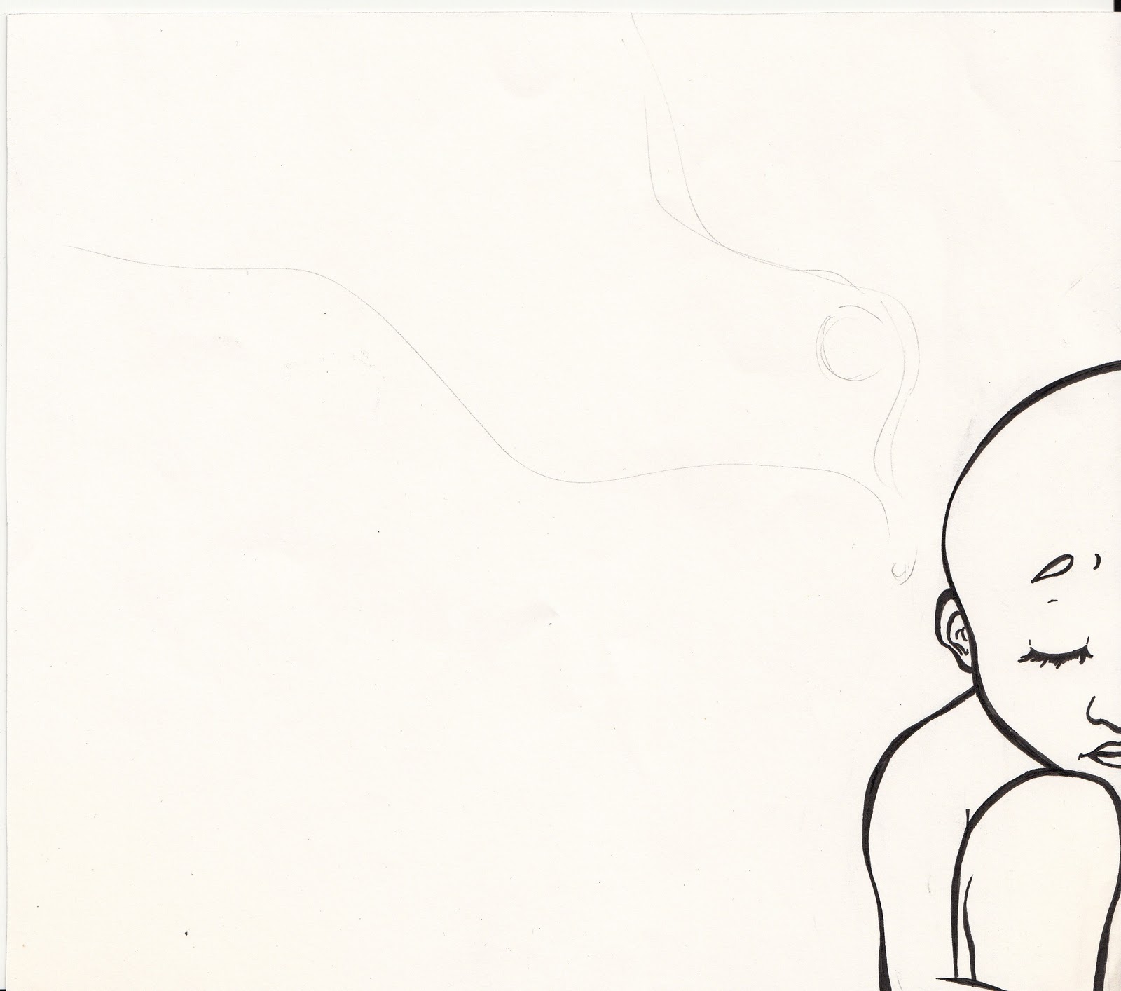
 |
| The bald Lorena amidst smoke |
 |
| Smoke and Mirrors. Trying to create images in smoke. |
 |
| Putting the two pages (of the 1st spread) together. Too bad our scanner is too small! |
 |
| Lorena in the cold cold night |
 |
 |
| Giving her back her hair and lost dignity |
 |
| Dreaming of food |
 |
| UniPin Water and Fade Proof Pigment Ink on bond paper |
The next stages of this project has yet to be posted! :)
Friday, November 25, 2011
A Little Early For Gong Xi Gong Xi
I've been searching for some time and inspiration to continuously make new artworks, or at least finish the current ones I've started. So far, I've been a failure to my own ideals. Insert sigh here. I hope somehow school wouldn't interfere as much anymore! Hahaha!
Here's hopefully something that would dampen the creativity pool. An old poster I did over a year ago for a Chinese New Year event. It's kind of telling me to paint a series of Asian-themed works! Hmmm... let's hope I get to do so!
Here's hopefully something that would dampen the creativity pool. An old poster I did over a year ago for a Chinese New Year event. It's kind of telling me to paint a series of Asian-themed works! Hmmm... let's hope I get to do so!
 |
| Chinese Ink, Photoshop editing |
Thursday, November 24, 2011
Doodle Nostalgia Part 2
Here are some of the more serious works of art that I've done in the past. Looking at these, I can't help but ask myself, how could I have done these?? Wished I still had that sense of artistic inspiration. Time to find some!
Here's to youthful creativity! :)
 |
| This is a design for frosted glass art. If you visit my high school prayer room, you'll find the finished work there. (Pentel Pen black permanent markers on letter bond papers) |
 |
| Close up on Christ. This was one of my proudest works :) |
 |
| An old semi-crammed class poster project. No Photoshop or computer editing was done - all old school! That was when I didn't know the famous line in the 60s was literal! (Faber Castel colored pencils, Faber Castel watercolor pencils, Unipin Water and Fade proof pigment ink on Oslo paper) |
Here's to youthful creativity! :)
Saturday, November 05, 2011
Can't Stay Vintage For Long
I haven't been posting any wardrobe pictures recently because 1. I've been wanting to focus this blog on artworks... 2. ...since I'm not really a big fashionista (just a person with great appreciation!) and 3. My camera just went into hibernate for me to take pictures in my daily life :(
But last October 30, I attended the afternoon shows of the Philippine Fashion Week and luckily, there were so many cameras all around! So here's a quick peek at what I wore.
I really wanted to show this outfit because it only proves that trends come around! Can you believe that THAT maxi skirt is around 20 years old? Almost the same age as me! My mom bought it for herself and then eventually gave it to me a couple of years back. Never got around to wearing it until this event. Since it was an afternoon show, it was perfect for a summer-y vibe look (my favorite kind of "vibe"!). Thank you, Mom, for your incessant effort to vacuum seal your old clothes!
Age old fashion advice: Never throw anything away (well, at least pieces as classical as maxi skirts)!
But last October 30, I attended the afternoon shows of the Philippine Fashion Week and luckily, there were so many cameras all around! So here's a quick peek at what I wore.
 |
| H&M basic tank top, vintage maxi skirt, Charles & Keith platform shoes, Mango and F21 accessories |
Age old fashion advice: Never throw anything away (well, at least pieces as classical as maxi skirts)!
Saturday, October 22, 2011
Doodle Nostalgia Part 1
Since all my art's been on a lag right now, I've decided to post all my funny "young" illustrations back when I was in high school. How these doodles make me so nostalgic! Lo and behold, my works from years back!
 | ||
| For a poem called "Krispy Kreme" |
 |
| Random comic strip 1 |
 |
| Random comic strips 2 |
 |
| Random comic strips 3 |
 |
| For a poem entitled "The Next Tragedy" |
 | |
| For a poem entitled "The Little Girl in Your Dream" |
 |
| An unused art spread for my high school yearbook |
 |
| One of most amateur but most hopeful sketches |
Subscribe to:
Posts (Atom)